Logo redesign and the thoughts behind
This post was originally published in the VG Tech Blog.
Vektklubb is the largest weight loss service in Norway, owned by VG. The goal is to help people loose weight by eating healthy food and exercise. No diets, no starving. We believe that changing habits over time is key to achieve a better and healthier lifestyle. The service has been around for ten years, and is still going strong! However, last year it was time for a makeover.
Digital makeover
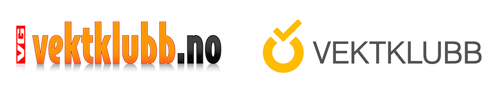
We created a new visual profile, re-styled most of the website (and made it responsive) and created apps for Android and iOS. The first step was to redesign the logo. The technology is moving fast forward, we are frequently being introduced to new digital surfaces and formats, and the graphics should preferably fit nicely into all those spaces.
We needed a flexible logo, made for different scenarios (app icon, banner ads, etc). The solution was to create a symbol that could be used on its own or supported by typography. The VG logo and the .no was removed, and the typography went through a drastic slimming process, leaving gradients and shadows behind. The already well established orange was kept, however some red had to go.
So far it all seems like easy decisions, right? Well, the biggest challenge was still to come; creating the symbol. There are many ways to design a logo, this is how I did it. This time.
It all started with brainstorming based on user feedback, interviews and general research. Then sketching. Lots of sketching. Can´t really draw, but it helps to get the ideas spread out on paper. Feel the shapes, accidentally drawing that wrong line that in the end turns out to be pretty cool. Or not. Creative block and frustration. No pressure! “It´s just a logo”. Not for me. It has to communicate, be unique and recognisable. Finally finding a concept that could work. If only…it looked balanced. Tweaking. Moving the same line back and forth. Then hearing my colleague say “Its done”. That feeling. When you still think there is a long way to go, but everyone else acknowledge it as a finalised piece of work. Realising it´s actually completed, lower my shoulders, relax. Well, there is no such thing as relax. There is always a next step, which is good!
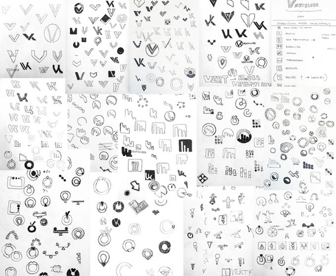
Some paper sketches from the Vektklubb symbol design process.
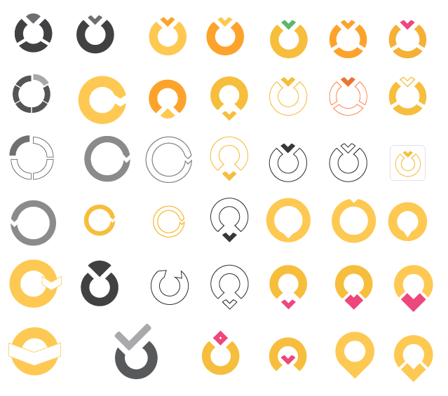
Tweaking. Exploring.
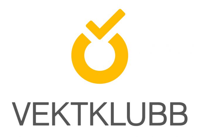
Final design
The thoughts behind:
The open circle represents the process towards a healthier life style hoping that one day the circle will be complete.
The v-shaped check mark reinforces the meaning of the circle, and symbolises the successful completion of a diary entry, weight program or life goal.
The logo symbol colour is based on established associations to Vektklubb. This energic orange colour is light, fresh, warm and inspiring.
Colour it beautiful
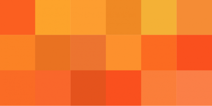
Above are some of the orange shades I found on the old Vektklubb website. In addition to the new logo symbol colour I added two more orange shades to the new colour scheme. Less is more. I also included green representing the food section, purple for exercising, pink serves as a negative/warning colour, blue is weight & measures, and a lighter blue was chosen for water registration. This way the colours get a meaning, and the users can easier associate them with the different sections.
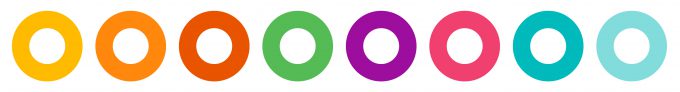
Vektklubb´s colour scheme.
Logo in context
Top of the new vektklubb.no:
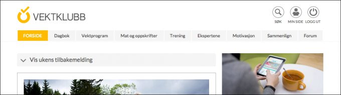
Vg.no newsfront:
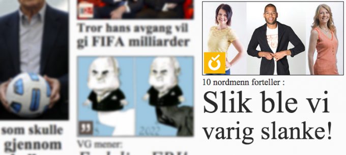
The icon makes it easier to spot the Vektklubb articles featured on the vg.no news front. This version is inverted to make the most of the orange, which is often more eye catching than white.
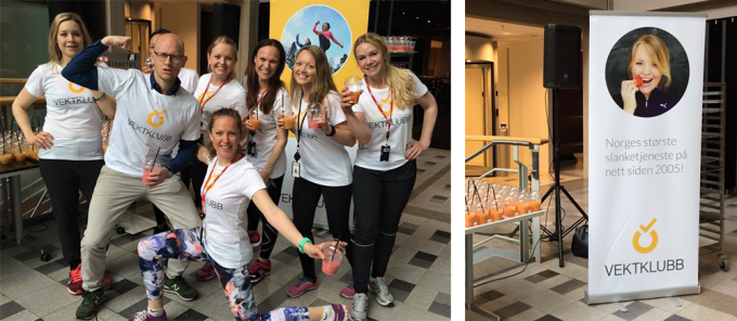
Vektklubb event:
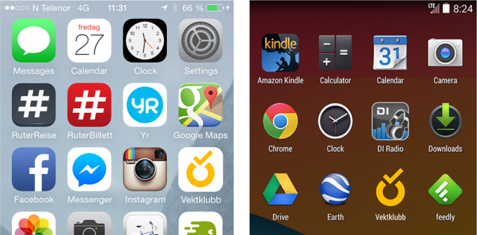
App icons:
Wrap up
Logo design is always challenging. There are many ways of approaching the task, depending on time restrictions, experience and personal preferences. In most cases it´s very time consuming, especially when the designer experience a creative block. The best part: you usually never know where you´ll end up!