Is my pink your blue?
This post was originally published in the VG Tech Blog.

When I grew up, far above the arctic circle, I was told that the sun is yellow, the sky is blue and the grass is green. However, most of the year the sun was gone, the sky was black, and the ground was covered with snow. Associations to colours were not always consistent. Light, and the environment around us, determines how we perceive colours. I do not know if everyone with normal vision see the same colours. My pink could be your blue, and so on. What I do know, is that some people are colour blind, some have low vision and some are blind. As a designer, I have a huge responsibility to create the best solutions possible, accessible for all. Recently, I have been diving into a wide open ocean of knowledge, swallowed some salty water and floated up with increased insight.
Web content accessibility
Earlier this year a new regulation for universal design of information and communication technology (ICT) solutions took affect in Norway. This means that all new web sites and self-service machines should follow a set of guidelines to create solutions that can be used by as many as possible. All existing solutions have to be updated by 1st of January 2021. One of the requirements in the guidelines describes the use of colour, while another stresses the importance of contrast.
Colour
Simply explained, colour is light interacting with our eyes. Light is made from electromagnetic waves, which travels in different wave lengths. When light hits objects some wave lengths get absorbed and some reflected. The reflected waves appear to our eyes as different colours.
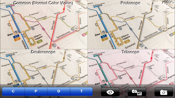
In the context of design, colour plays a major role. When choosing colours it is important to understand how they will work together in their final environment. A metro map is a good example of this. A purple line and midnight-blue line on the same map could easily be mixed up and frustrate travellers. A simple solution could be to add different patterns to the lines so they easier can be differentiated. This problem applies to the digital media too. A coloured web link in the body text is more obvious and visible if we add an underline. To indicate an action or communicate a message effectively, colour should not be the only visual element.
Something to think about:
– Colours convey meaning. However, be skeptical to the “pop psychology facts” about colour; is purple really creative and blue trustworthy? And what if you are colour blind?
– Any colour can grab our attention, it all depends on context! A green button may be more visible than a red button if everything else around is in red, and vice versa.
– Abstract associations, as well as personal context and past experiences, can evoke emotions when exposed to certain colours.
Colours look pretty!
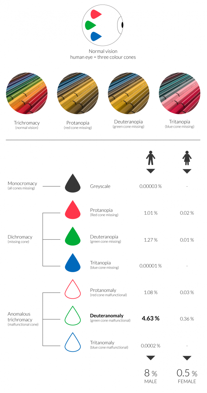
Colour blindness
Not everyone perceive colour the same way. About 8% men and 0.5% women are colour blind, meaning they have limited ability to distinguish between some colours.
There are three main types of colour blindness:
– Anomalous trichromacy – malfunctional cone (red, green or blue)
– Dichromacy – missing cone (red, green or blue)
– Monochromacy – greyscale
The human eye has three colour-cones; red, green and blue. When one cone is malfunctional or missing, the eye will perceive colours differently. In rare cases more than one cone can be malfunctional or missing.
Red-green colour blindness is a generic term for all forms of red and green colour vision deficiency. Most colour blind people are either red-blind or green-blind (or blue-blind). That said, being red-blind does not mean that red is the only colour they can not see, the whole colour spectrum is affected. Red is part of many other colours, like orange, purple, pink and brown. These colours may look different too. Red-blind and green-blind people are usually confused by the same colours, typically red, orange, yellow, green and brown. However, not all red and greens are impossible to distinguish, and there are different levels of colour blindness. Usually, red-blue and yellow-blue colour combinations are safe to use, with a few exceptions for those with monochromatic colour blindness.
I’ve created a visualisation of the different types of colour blindness, see image below.
Please note: I could not find a verified source of statistics, so the percentages below are approximate (based on various web sites).
Contrast
Colour combinations are important to create satisfied contrast. Not only colour blind are affected, but also people with low vision. The third group, which is easy to overlook, is everyone else using screens. The environment and context play a huge role. I am sure most of us have been using mobile devices out in the sun, or been annoyed of reflections on the computer screens. Designing for all does not only include people with disabilities, but it creates a better experience for everyone.
Techniques
– Create a greyscale version to check contrast
– Simulate the colour blind experience by using different tools (see TOOLS below for examples)
– Test on a variety of devices and in different environments
– Do some usability testing
Tools
Below are a few.
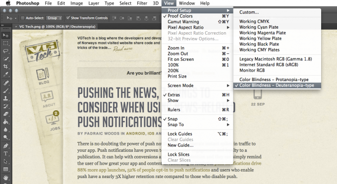
Adobe Photoshop and Illustrator
View – Proof Setup – Color Blindness (Protanopia-type or Deuteranopia-type).
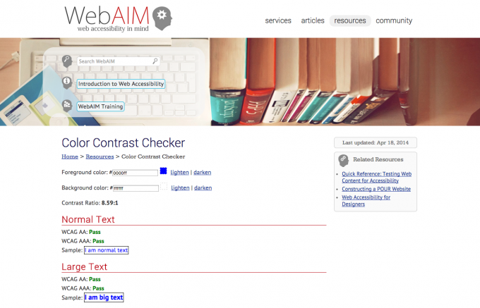
WebAIM Color Contrast Checker
Easily check the contrast ratio of the colours used in your design, and if they meet the WCAG 2.0 standard or not. webaim.org/resources/contrastchecker
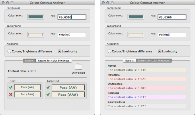
Color Contrast Analyser
This application also simulates some visual conditions like dichromatic colour-blindness (can only see two of the three fundamental colours) and cataracts (clouding of the eye’s natural lens). paciellogroup.com/resources/contrastanalyser
Chromatic Vision Simulator app
Take photos of whatever you want, or simply just view the world through the screen of your phone!
Color Contrast Analyzer – Chrome extension
Use this extension to check the text contrast of a web site. Select Medium Bold and Large Non-Bold or Small Non-Bold text, on level AA or AAA.

Conclusion
No matter what colours we use in design, there should always be a second way of understanding the purpose. Also, high contrast is essential when designing a good experience, not just for disabled people, but for everyone. And, do not forget the context!
So, is my pink your blue? I do not know. As long as my pink is my pink, I am happy 😉
REFERENCES: