Less is more
This post was originally published in the VG Tech Blog.
One of the things I remember the most from my first year at design school back in 2002 is the phrase “less is more”. The words originally came from architect Ludwig Mies van der Rohe in the early 20th century, and is the unofficial mission statement for the “minimalist” design trend. Twelve years later I can still hear the voice of my teacher explaining the importance of white space, contrast, typography and grids.
Minimalist design
During the Modern design movement in the early 20th century, we saw the emergence of several minimalist design trends like Bauhaus, Swiss Design and Helvetica to mention a few. Minimalist design aims to achieve better design through simplicity by keeping only the essential elements and removing the unnecessary that can disturb or confuse the end users. Inspired from these trends we still use many of the same design principles today. One of the most popular trends in digital interface the last few years is “flat design”.
Although the minimalistic design approach has been around for decades, the early days of the Internet did not typically apply many of the principles. With lack of styling and developers with little knowledge of online user experience, it looked more like a digital circus with bright colours, random gif animations and blinking content. Everything was screaming for attention.
The Internet has changed a lot since then. With the growth of the technology, new digital platforms and more knowledge about the users, we have a much better foundation for building good web sites. This does not mean the circus is closed.
Real vs digital
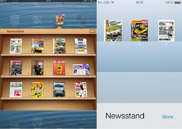
For a long time skeuomorphism was one of the most dominant trends online. The style uses real-world metaphors in on-screen design, which aims to make it easier for users to recognise functionality. Graphics are typically created to look three-dimensional, with patterns, shadowing and highlights. Skeuomorphism does not only apply to visuals, but also sounds and movements. For example, a camera shutter sound when taking pictures and a page-turning movement in eBooks. Another good example is Apple´s iOS6.
![]()
Apple iOS6 icons to the left and redesigned iOS7 icons to the right
[Image source: Apple´n´apps]
Modern Design at Microsoft
In 2010, Microsoft realised that their products were becoming too complex and the user focus was not highly prioritised. They decided to make a change, and with external influences like the Modern Design Movement (Bauhaus), International Typographic Style (Swiss Style) and Motion design (Saul Bass) they created a set of new design principles. The outcome was a series of products that looked and behaved like a family of devices. This new Microsoft design is known as Metro. This style is today also referred to as modern or flat design.

Microsoft Windows 7 vs 8 [Image source: Microsoft]
Flat design
The last few years we have witnessed many web sites and mobile apps that have adapted the “flat design principles” when designing for digital interfaces. One example is Apple, who joined the trend with their iOS7 launch in mid-2013. The concept of “flat” is pretty much self explanatory, it makes everything look flat. Remove drop shadow, gradient and textures, and most of the job is done. This simple two-dimensional appearance also makes it easier to design interfaces that are more responsive to different browsers and devices. Web sites load faster and resize more easily.

Apple iOS6 vs iOS7. Why make the newsstand appear three-dimensional on a digital surface? The papers will not fall down… [Image source: International Business Times]
The true challenge with flat design is to make all functionality clear to the user. Ideally, the design should be simple still aesthetically appealing with a touch of personality. It must be intuitive what is clickable and the content should be in focus.
Like any other design style, flat design has its typical characteristics. Some of them are listed below.
♦ Less is more
Elements without functionality is considered unnecessary clutter. The use of large elements, lots of “white space” and simple shapes all together help create an user friendly digital environment. Written content should also be thoroughly considered, what is really relevant and not. Avoid information overload to create a user friendly interface. Please note that the use of simple elements is not to be confused with “simple design”. Designing minimalistic can be just as complex as any other design style.
♦ Content in focus
Whenever new technology and devices enter the market we become fascinated about all the new interactive possibilities, and the content becomes a shadow of the interface. The main reason users enter a web site or app, and stays there, is to access content. On the other side, an appealing design is important to attract users in the first place. Flat design allows the content to stand out without unnecessary disturbing elements.
♦ Grid
The grid helps keep a structure in every design project. Alignment and spacing takes you a long way, however a proper grid could take you even further. An uncluttered design opens for a more complex grid structure, without making it look all messy. Experiment. Highlight important elements by breaking the grid.
♦ Typography
Clean typography is an important element in flat design. Besides communicating a message it is often used as the centrepiece of the design. Navigation and other written content should be worded simple and efficiently. Use of sans serif typeface, contrast in weight variations and size, and uppercase for navigation and key headlines are common.

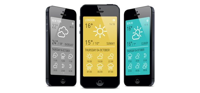
Colourful weather app that uses flat simple icons and typography. [Image source: Minimeteo]
♦ Colours
Go bright and bold! It is common to use a broad colour palette, and the most popular flat design schemes are bright and saturated. Good contrast and colours that work well against both light and dark background creates clear and readable elements.
♦ Flat graphics
Most digital interfaces use icons. Some use illustrations. Common for these in the flat design style is their two-dimensional appearance. Shadows, textures and other unnecessary details are stripped away or kept to a minimum. Icons should be simple in style and indicate universal actions or purposes.

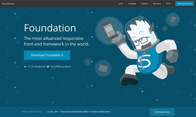
The Foundation web site uses simple typography and flat illustrations with some depth.
[Image source: Screen shoot of foundation.zurb.com]
The last few years flat design has turned into a popular minimalist design trend. Is it here to stay, or is it a passing trend? Highlighting the content and focusing on the users need is key for this two-dimensional design style to work well. When designing with simplicity in mind we may have to exclude a lot of creative ideas, however thinking minimalistic is a creative process itself. Making design decisions based on what is best for the users is quite a challenge.
Even though flat design in many cases improve user experience, it does not mean it is the one and only way to go. Depending on the project, the message and content should influence the design style, not the other way around.
It is impossible to predict the future, but I am pretty sure I will never forget my first year at design school. Less is more.

